Client:
MY LICEO WORKSHOP SCHOOL
Year:
2017
Country:
COLOMBIA
My Liceo Workshop School, it’s an educational institution based in Jamundí, Colombia. with 18 years of experience in the market we were invited to be part of the organization’s restructuring process, particularly with the launch of their new Early Stimulation Center.
Guided by the social-cultural pedagogy of Lev Vygotsky, practiced in the institution; we generated a system of visual identity that allows us to strengthen the idea of taking advantage of each opportunity, in a meaningful learning experience. That is, starting from elementary elements to also training collaborators in the creation of new teaching perspectives.
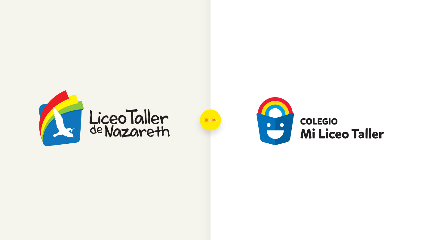
The name and the previous logo were based on imprecise concepts about the pedagogical orientation of the school. After brief market research, we pushed for a total reinvention of the name and a results-focused strategy.

Happiness is the fresh concept that brings together the design of the brand of this project. What more inspiration than the smile of the younger kids as they go on their first day of school? Friendship, love, solidarity, and above all, joy, were fundamental to closing the idea.

Business Unit: Maternity Ward.

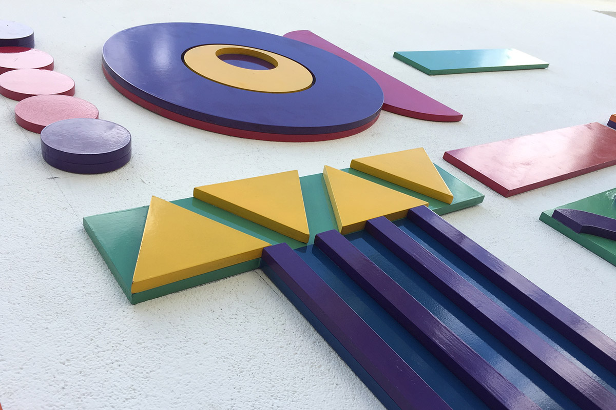
The identity system is developed from the Russian aesthetic explorations and artistic avant-gardes of the early twentieth century (especially constructivism), articulating the pedagogical proposal of the same origin. The line, the point, the triangle, the squares, are the resources that we connected with the proposal together with a vibrant and attractive color palette, which would allow us to fully differentiate ourselves from other institutions.
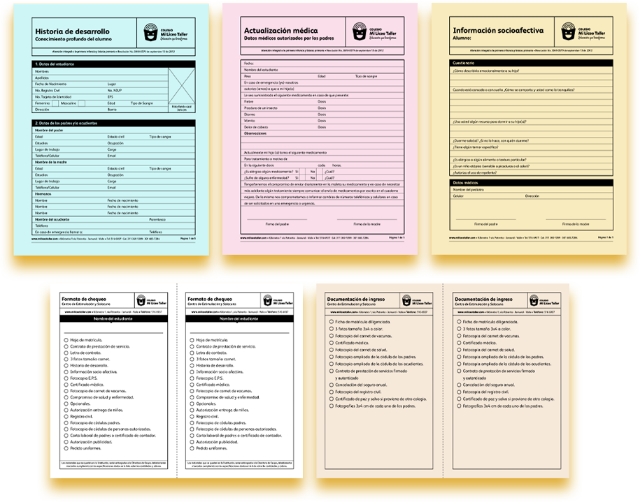
The system was able to be verified in a large amount of communication material in the institution, from the stationery of inscriptions to the uniforms of the infants. In the same way, the collaborators managed to include some elements intuitively in their daily work.


The system was implemented across a wide range of communication materials within the institution, from enrollment paperwork to children’s uniforms. Additionally, staff seamlessly integrated certain elements into their daily routines.


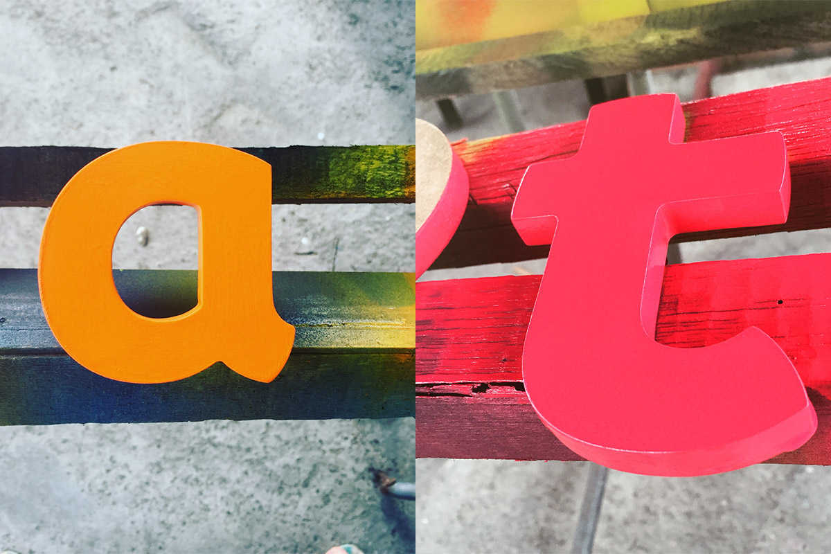
We designed a warning that would be felt by the people who transit the front of the facilities. It is a bet that allows to generate sympathy with the neighbors of the place and at the same time connects to clarify the idea of what it means to be a stimulation center.


