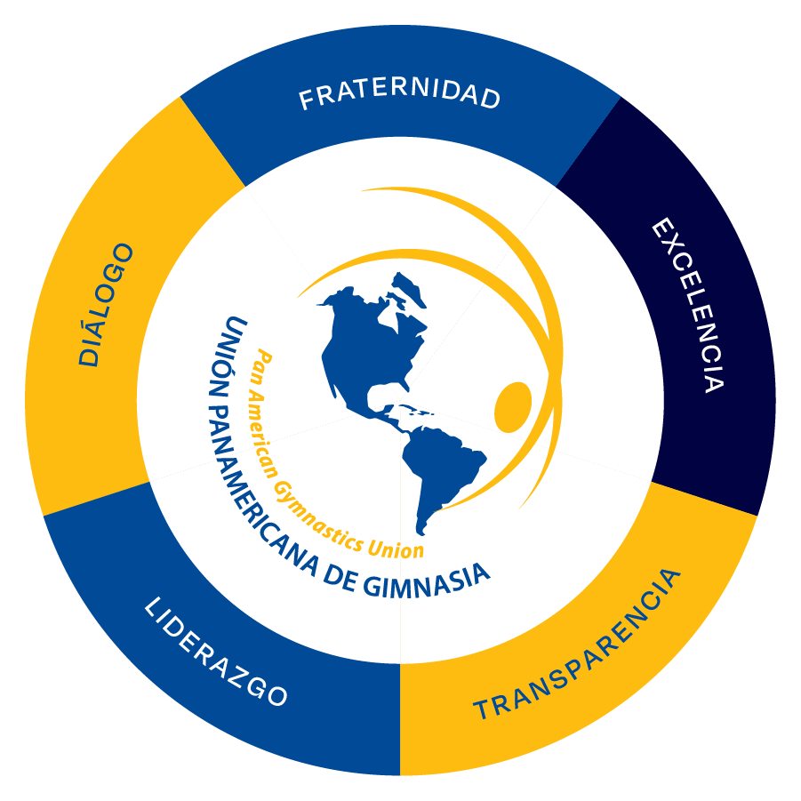
The Panamerican Gymnastics Union (UPAG-PAGU) is the official governing body for gymnastics in the Americas, from North America all the way down to Patagonia. We were tasked with creating the organization’s visual identity and making some tweaks to the logo.
Focus on creating a dynamic, powerful, and easy-to-manage identity. It should allow the organization to handle it with their current team and communicate its essence effectively across English, French, Spanish, and Portuguese.
Given the organization’s long history, transforming the logo wasn’t within the scope, but we managed to condense some original elements. We emphasized the Americas, removing the European strip that was visible in the original symbol.


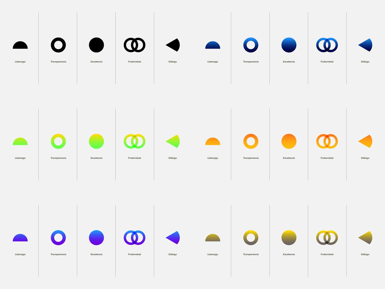
UPAG has 5 pillars that support the strategic structure within the organization. All initiatives are built around these. Based on this framework, we proposed two communication scenarios: one corporate and one for each discipline. Therefore, we needed to link what we considered from the execution of the disciplines:

Using the circle and its shapes, we created container elements that allow for brand communication from a corporate perspective, swapping out some colors to generate more options.
On the other hand, the elements used for the disciplines are bolder and tied to the expression of movement in each category. This allows the graphic design or communication team to emphasize the publication’s focus or unfold more effortlessly.

We used Degular, a font with geometric features and notable ink traps that allowed us to balance the shapes and movement of the photos.
The color palette consists of bright, digital, and vibrant tones that express the characteristic colors of an Olympic presentation.


