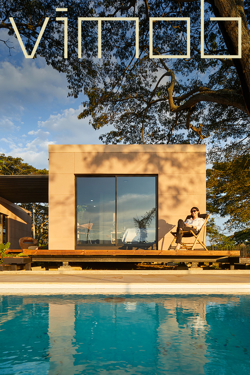
We developed the visual and narrative identity for one of the most recognized contemporary Colombian architectural products in the country. Its design, rooted in circular economy and sustainability, inspired us to create a clear and honest identity, allowing the product to speak for itself.
The materiality, simplicity, and eloquence of a product inspired by Mid-Century Modern design, combined with the power of an innovative industrialized housing product.
Vimob is the union of vivere and mobile, conveying the idea of a home you can take anywhere.
With a simple logo inspired by architectural design visuals, we made subtle adjustments to enhance legibility at smaller scales and to establish a cohesive, minimal language between each letter.


We turned to materiality to better understand the product and its expression, bringing it into the graphic realm without losing its essence.
This led us to experiment in our studio with textures, typography, the logo, and its relationship with the graphic richness of the product’s photographs. It was here that we realized the importance of maintaining a simple visual approach, yet with a vibrant and natural color palette, full of contrasts, to powerfully express the brand.


The concept of circular economy, as interpreted by vimob, was crucial in reinforcing the idea of the “future.” In other words, sustainable architecture is no longer a luxury or privilege—it is a necessary demand.


Just like construction blueprints, we created a four-layer design structure for the graphic system, consisting of the photographic background, a grid, typography, and the identifier.
This structure allows designers to easily arrange each element, following an assembly sequence inspired by the product’s industrialized concept—a sort of “DIY” approach.


Iconography plays a fundamental role in conveying the product’s attributes and benefits with minimal resources. Inspired by the logo—its shapes, elements, and compositional forms—it ensures the scalability of the system for future creations and maintains a harmonious relationship between typography and imagery.


We focused the system on digital communication, with limited use in print to align with sustainability principles, minimizing the production of physical graphic materials.
Nevertheless, we refined every detail of the identity to effectively convey that sense of “quiet luxury” in every application, adhering to the Mid-Century Style maxim: Less is more.


