Client:
IT business services
Year:
2020
Country:
COLOMBIA
ITSE is a company from Cali Colombia, which specializes in providing IT infrastructure services, hardware, software, and robust cloud storage. With more than 15 years in the market, it has become an expert in serving companies in the financial sector.
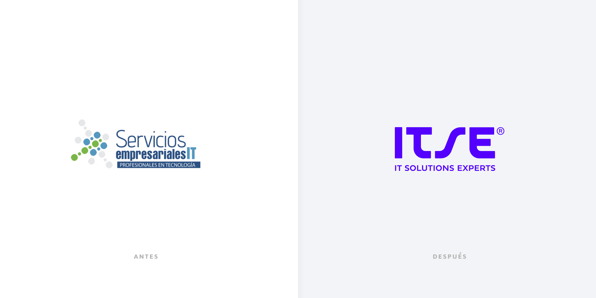
Reimagining the visual identity in a way that’s totally consistent, taking a strong cue from how they current customers see them. We use the info we gather to really solidify they image and attract new folks through the door.
We designed a logo that represents how simple and easy a company can manage robust and complex technology. We also integrated into the logo the gesture of S, which indicates the idea of ascent, displacement from one place to another. A metaphor of the “exponential evolution” that ITSE proposes by accompanying its customers with the bold use of technology.
Brand architecture
During the project development, ITSE aimed to the future by incorporating in its services the development of customized digital platforms, integrating its extensive knowledge in Microsoft’s technological tools, as a competitiveness factor. From this initiative comes ITELLUS, its own brand of technological development focused on all automation processes.


Customers and users guided the new implementation of the brand strategy. We went from “enunciating an experience” to “planning the brand experience.” Leading by specific postulates, the company will make decisions about its brand actions to handle any type of situation that may arise.
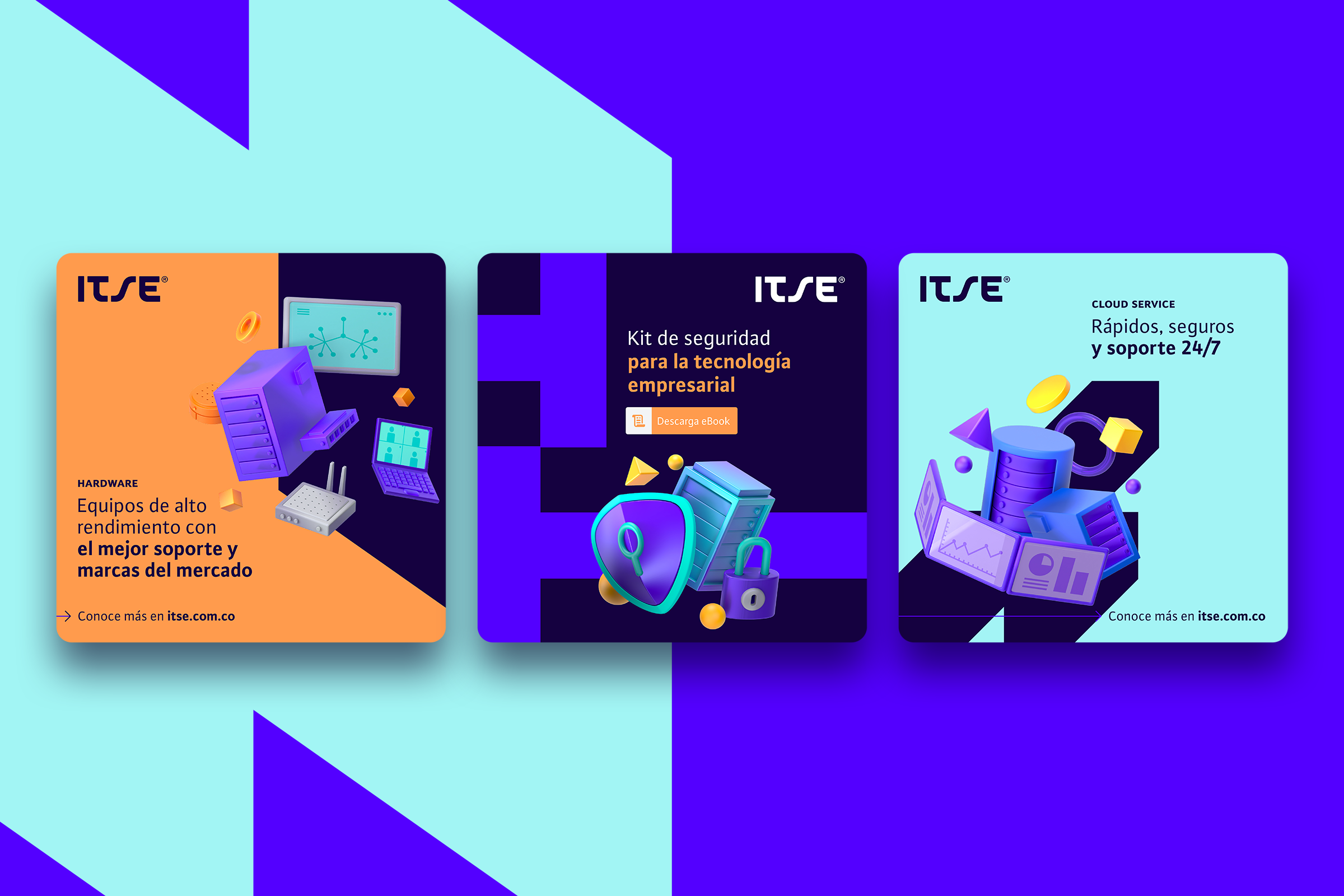
A bold color palette, which integrates vibrant colors, very close to the technological sector. We defined morphologies that would allow us to design numerous pieces, with different compositions, but always focused on showing the benefits and attributes of the brand.

We created pictograms based on the logo features, added straight lines and rounded vertices. These aspects allow us to associate the logo composition with the brand’s simplicity.

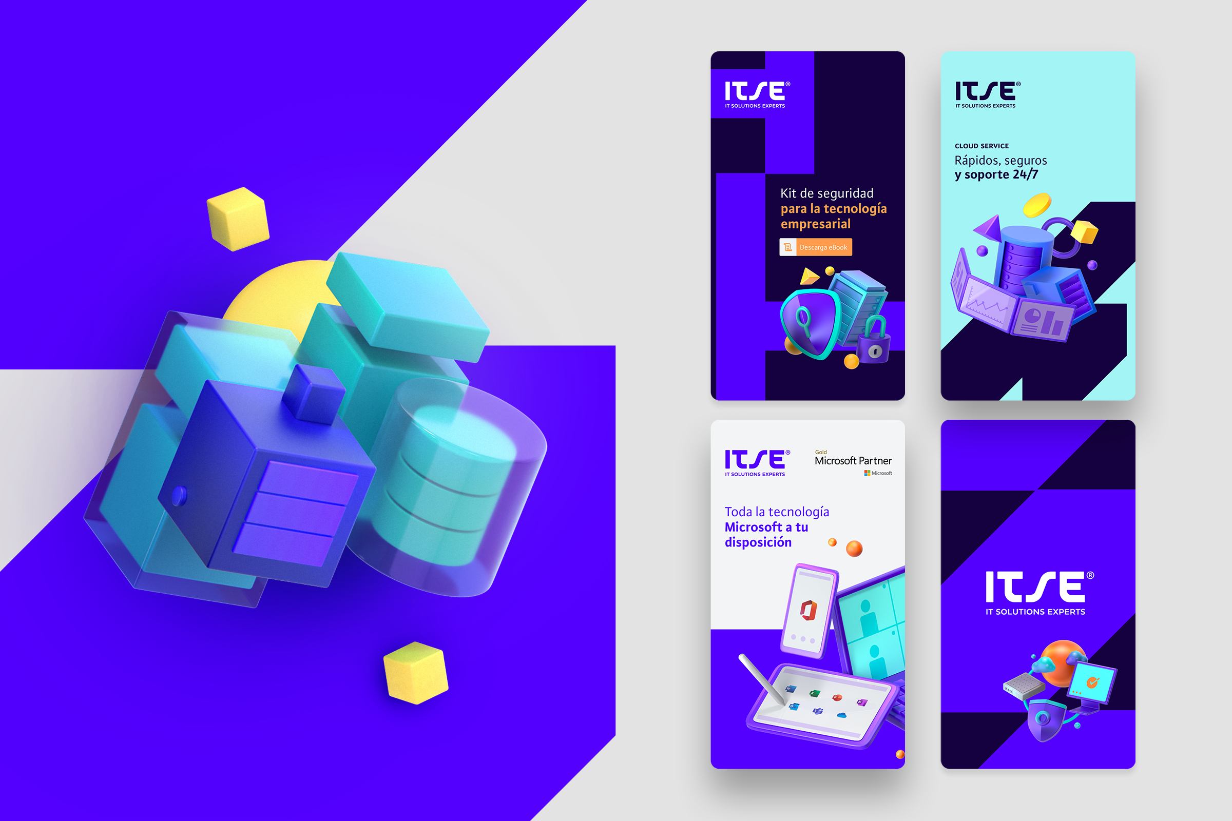
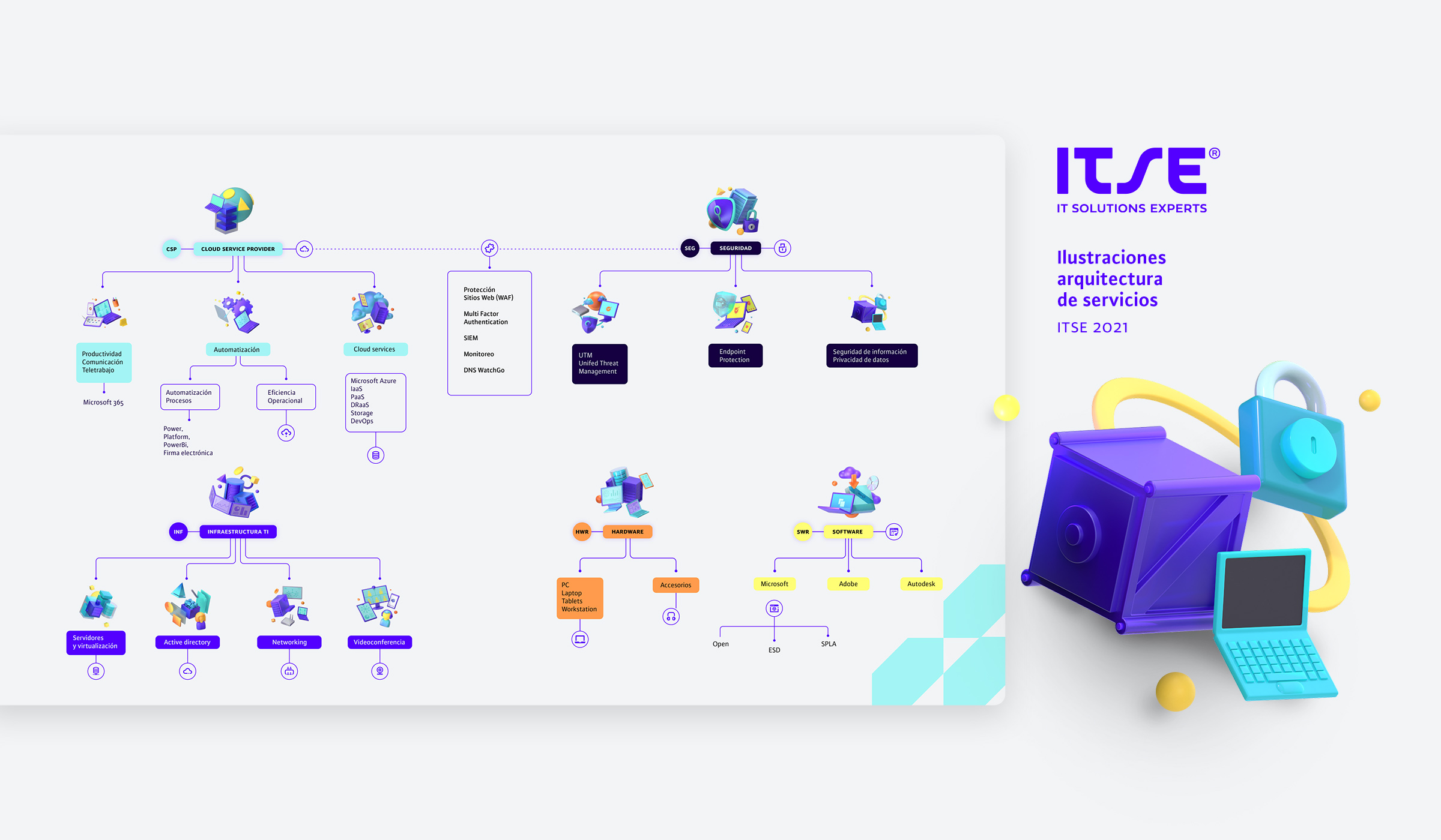
One of the precepts of identity is: “Easy technology.” We represented this in 3D illustrations that facilitated the relationship of the concept with the complexity of technology, which made it close and understandable at all levels. In the same way, they responded in a concrete way to the company’s service architecture.

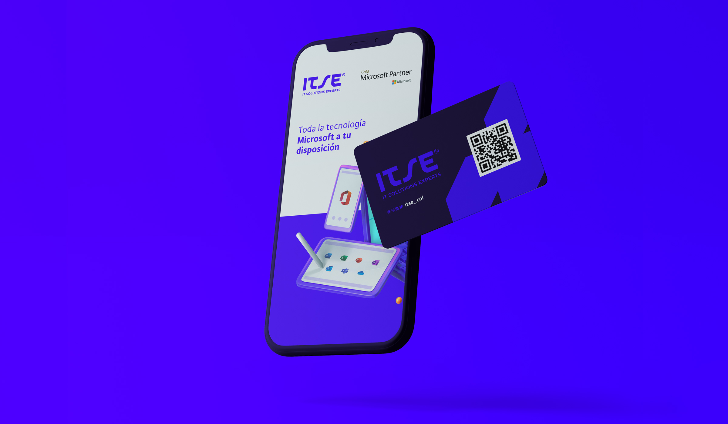
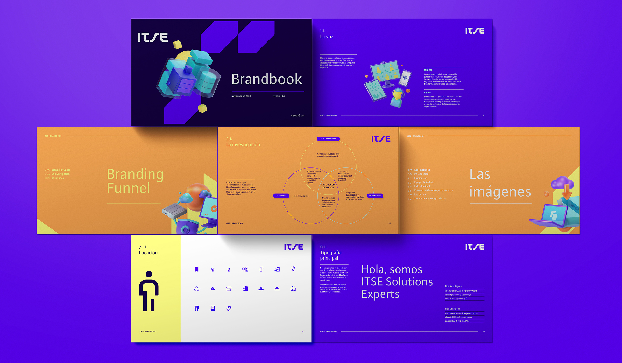
We created a large set of graphic material so that the work team of the organization will correctly implement the developed identity. These materials were from posts on digital platforms to covers for reports. We also included traditional corporate material.


